Configuration
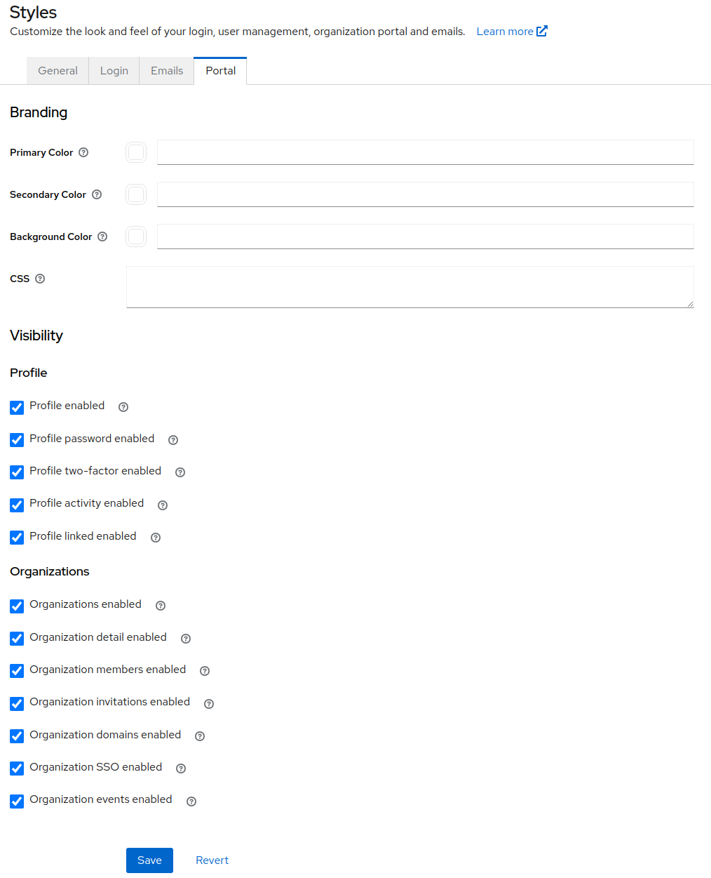
In the Styles->Portal section of the admin UI, it is possible to configure user access to portions of the portal. This has the effect of limiting the self-management functionality that is available to your users. Two of the sections below — Passwordless and Attributes — do not have a checkbox in that panel yet; set their realm attributes directly to toggle them. The sections are:
- Profile View and edit profile information such as first name, last name and email. View and edit credentials, linked account, and manage authenticated sessions.
- Password update Update password.
- 2FA create/update Add and remove 2FA mechanisms like OTP and WebAuthn.
- Passwordless Add and remove passwordless WebAuthn credentials.
- Device activity View and terminate active authentication sessions.
- Linked accounts View, create and remove links with social and other identity providers.
- Organizations View and (conditionally) edit details of organizations for which a user is a member.
- Details View and edit organization profile information.
- Members View and manage organization members and their roles. Invite new members.
- Invitations Invite new members.
- Domains Add and verify email domains for SSO login.
- SSO Create and update SSO connections to organization identity provider.
- Events View events related to organization member activity.
- Attributes View and manage custom organization attributes. Members with the
view-organizationrole see the attribute list; members withmanage-organizationcan add, edit and remove entries.
Styles
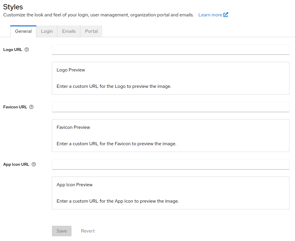
Currently, the logo and favicon set in the general styles section will be used when rendering the portal in order to preserve your branding.
The portal is built on shadcn/ui components that read their colors from CSS variables. Your branding is applied at runtime: a small set of theme tokens is resolved from realm attributes and injected as a <style> element that overwrites those variables, so changes take effect immediately without rebuilding or redeploying anything.
Theme tokens
Brand tokens are shared across surfaces. Each one is a realm attribute prefixed with _providerConfig.assets.theme.v2. — for example, the primary token is set with _providerConfig.assets.theme.v2.primary. The same attributes drive the phasetwo-ui login theme and the email templates, so branding a realm once brands all three.
Every color token takes an optional dark-mode override named dark<Token> — for example _providerConfig.assets.theme.v2.darkBackground.
#rgb and #rrggbb hex values are the recommended format. Bare CSS color keywords such as red, and the rgb(), hsl(), hwb(), lab(), lch(), oklab() and oklch() functions, are also accepted — but contrast is only measured from hex, so a keyword or color function leaves foreground at its built-in default and resolves primaryForeground and secondaryForeground to white. Set the matching foreground token explicitly whenever you use one.
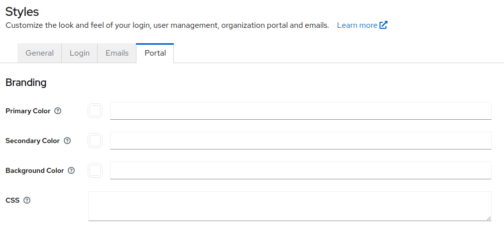
Because these tokens are shared rather than portal-specific, the admin UI edits them under Styles->Login — the Styles->Portal tab still shows the legacy portal colors described below. You can also set them with the Keycloak Admin REST API or in a realm export JSON.
The full token list — nine base tokens with built-in defaults, six derived tokens that follow a base token until you set them, plus radius and fontFamily — is documented once in Customizing the UI, since the same tokens drive the login pages and email.
The Admin Portal's own defaults differ from the login palette in two places: primary defaults to #1570c2 rather than #3b82f6, and radius to 0.5rem rather than 0.625rem. Those apply only where you leave the token unset.
The --sidebar-* variables have no tokens of their own — the sidebar is a recessed surface, so it reuses muted for its background, border for its hover tint, and primary for the active item and focus ring. Brand those three and the sidebar follows.
Precedence
Every token resolves independently, first valid value winning:
- the
theme.v2.<token>attribute (ordark<Token>in dark mode); - for
primaryonly, the legacyprimaryColor700attribute; - for a derived token, the base token it follows;
- the built-in default for that mode.
A value that is not a valid color — or not a valid CSS length, for radius — is treated as unset and falls through to the next step.
Three behaviors are worth knowing:
- Brand color is mode-independent. Set
primaryorsecondaryand leave the dark override unset, and dark mode inherits your light value rather than reverting to the default. Surface and neutral tokens never inherit: a lightbackgroundwill not light up dark mode. - Foregrounds auto-contrast.
primaryForegroundandsecondaryForeground, when unset, are computed as a readable near-black or white from the relative luminance of their background.foregrounddoes the same frombackground, but only when that value is a measurable hex color — assuming a dark background would put white text onbackground: white. - Values are validated before they reach the stylesheet, so a malformed attribute cannot break out of the rule.
Legacy colors
The older _providerConfig.assets.portal.primaryColor* and _providerConfig.assets.portal.secondaryColor* attributes are still read, but only primaryColor700 still affects rendering: it is the fallback for the primary token. Every other legacy key — primaryColor100, primaryColor200, primaryColor400, primaryColor500, primaryColor600, primaryColor900, secondaryColor800 and secondaryColor900 — is accepted and ignored. They used to style incidental details rather than surfaces, so promoting them would repaint the page with a color that never had that role.
secondaryColor900 deserves a specific note: it used to be the fallback for a separate cta token, the neutral emphasized action button. That token has folded into primary, so a realm that only ever customized secondaryColor900 should set _providerConfig.assets.theme.v2.primary instead.
These legacy fields are what the Styles->Portal tab of the admin UI shows today:
Custom CSS
You can also append arbitrary CSS with _providerConfig.assets.portal.css. It is appended last, into the same <style> element as the generated variables, so it overrides both the tokens and the built-in defaults. Target the CSS variables or standard selectors:
:root {
  --primary: #7c3aed;
  --radius: 0.25rem;
}
.dark {
  --background: #0b1923;
}
Custom CSS that targeted the old generated utility classes — .bg-primary-700, .text-primary-500, .bg-primary-gradient and friends — no longer has any effect, because the portal's components now use semantic shadcn/ui classes such as bg-primary and text-muted-foreground. Migrate that CSS to the variables above. Realms that customized primaryColor100 or primaryColor900 will see neutral surfaces after upgrading — the brand color is preserved through primaryColor700 and the CTA button color through secondaryColor900 — so set the matching v2 tokens to restore custom surfaces.
See the Admin Portal source code for further detail.